Trivago is one of the world-leading hotel search platforms online averaging 645,000 visitors per day on their website.
The essence of Trivago is to offer the best searching experience so that its users find the best deals effortlessly.
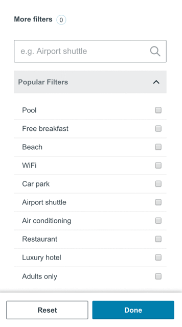
To achieve this goal, the platform offers a unique filtering experience called "Concept Search" that allows users to apply hundreds of tags to narrow down their search.
Objectives
The business goal outlined in this case study is to propose an evolution of the filter experience across desktop and mobile web.
Skills
Usability testing
UX optimisation
Accessibility (Inclusive design)
Style guide
Cross-platform (Desktop / mWeb)
Prototyping
Tools
Usertesting.com
Figma
Adobe Photoshop
Different layouts and desktop experiences
The search experience isn't something that is limited to a single industry, it spans across every field like searching for an app, searching for a flight, searching for a product, etc.
Therefore it is good to compare the two types of layouts commonly used on the market:
Inverted L
Stacked top bar

Inverted L vs Stacked Bar
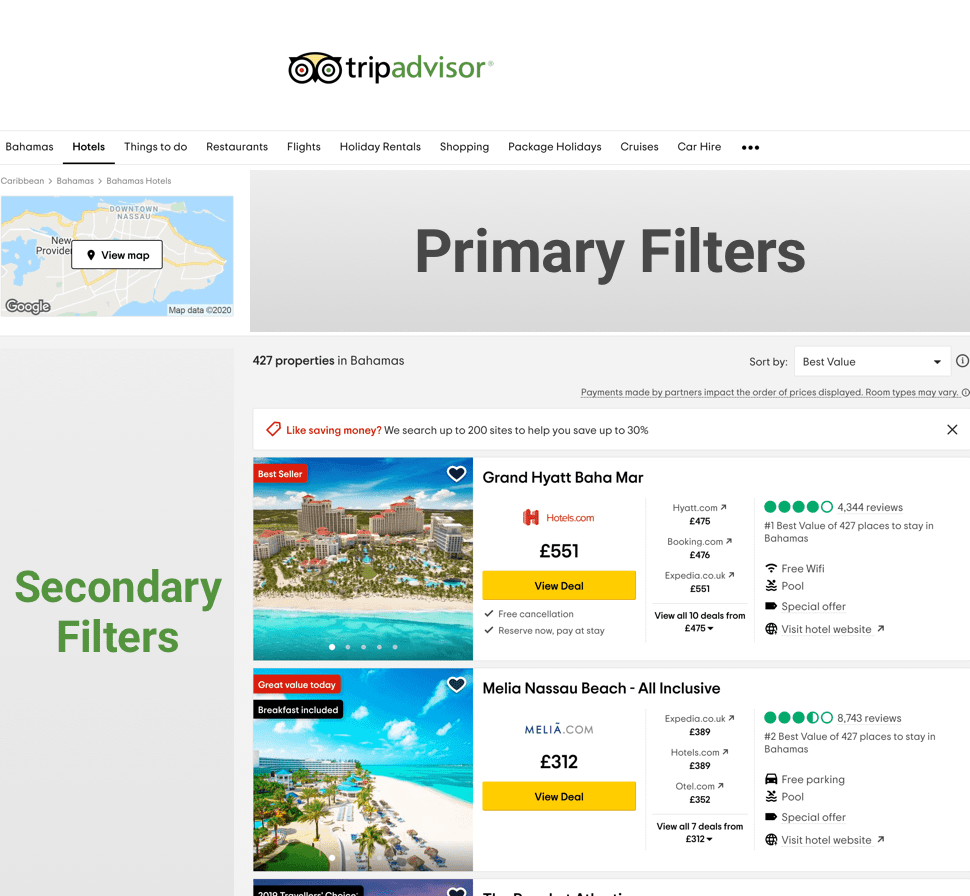
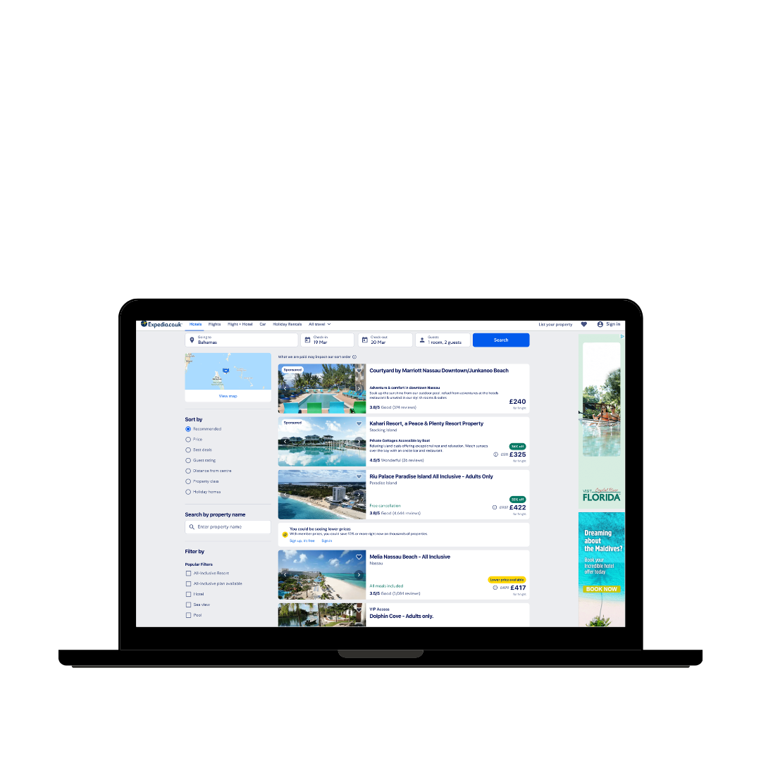
In terms of popularity, most websites opt for the "inverted L" style, displaying the most important filters horizontally at the top and every subsequent filter in a single column on the left. This is a progressive search where users add filters on the go rather than all at once.
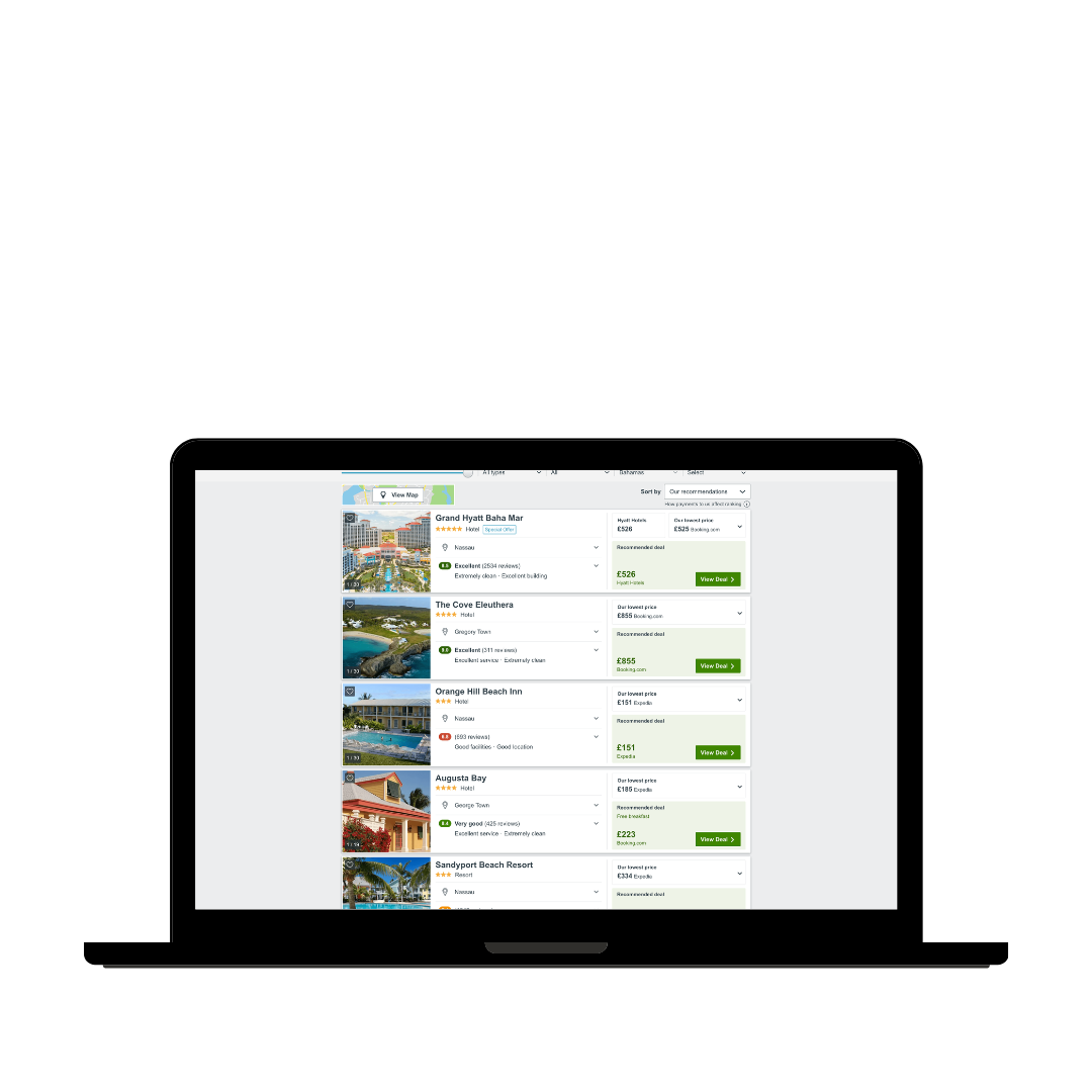
The stacked bar system available on Trivago puts more emphasis on the content of the search offering a more structured approach whereby users first curate their search filters before browsing the results.


Similar layouts, different mWeb experiences
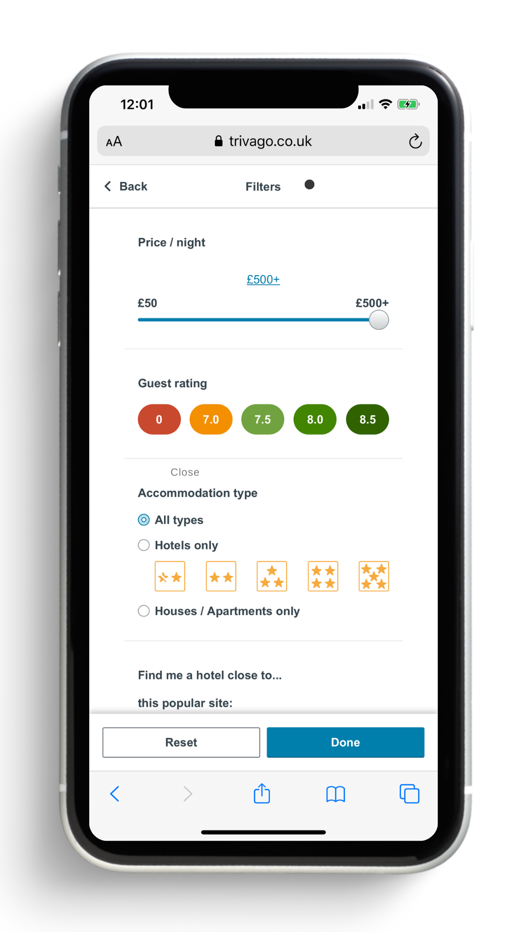
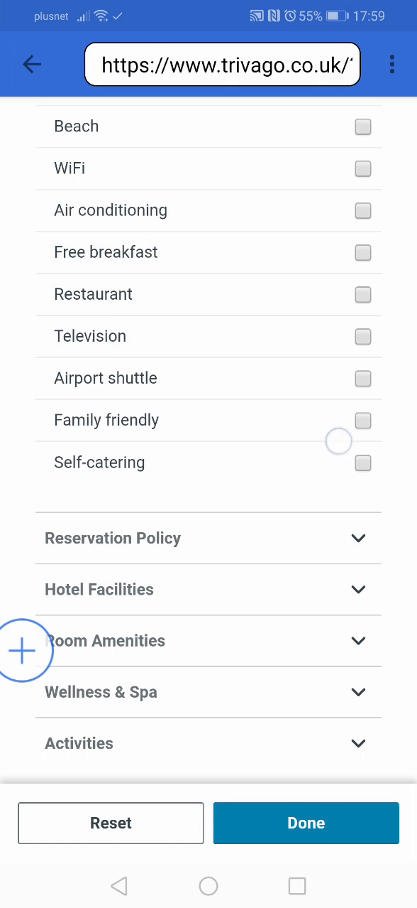
While the desktop experiences vary, due to the screen limitations on mobile, all the mWeb filter experiences are aligned. Filters are displayed within an overlay view.
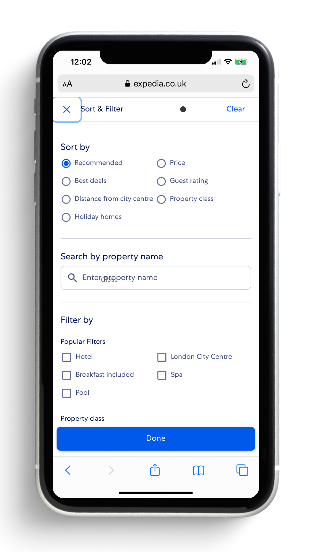
The main difference here is that Trivago keeps the same filter hierarchy (primary, secondary, tertiary) within the overlay, which the likes of Expedia don't have.
Something unique that Amazon has over the others is its dynamic filters that adapt based on the search.
Usability testing
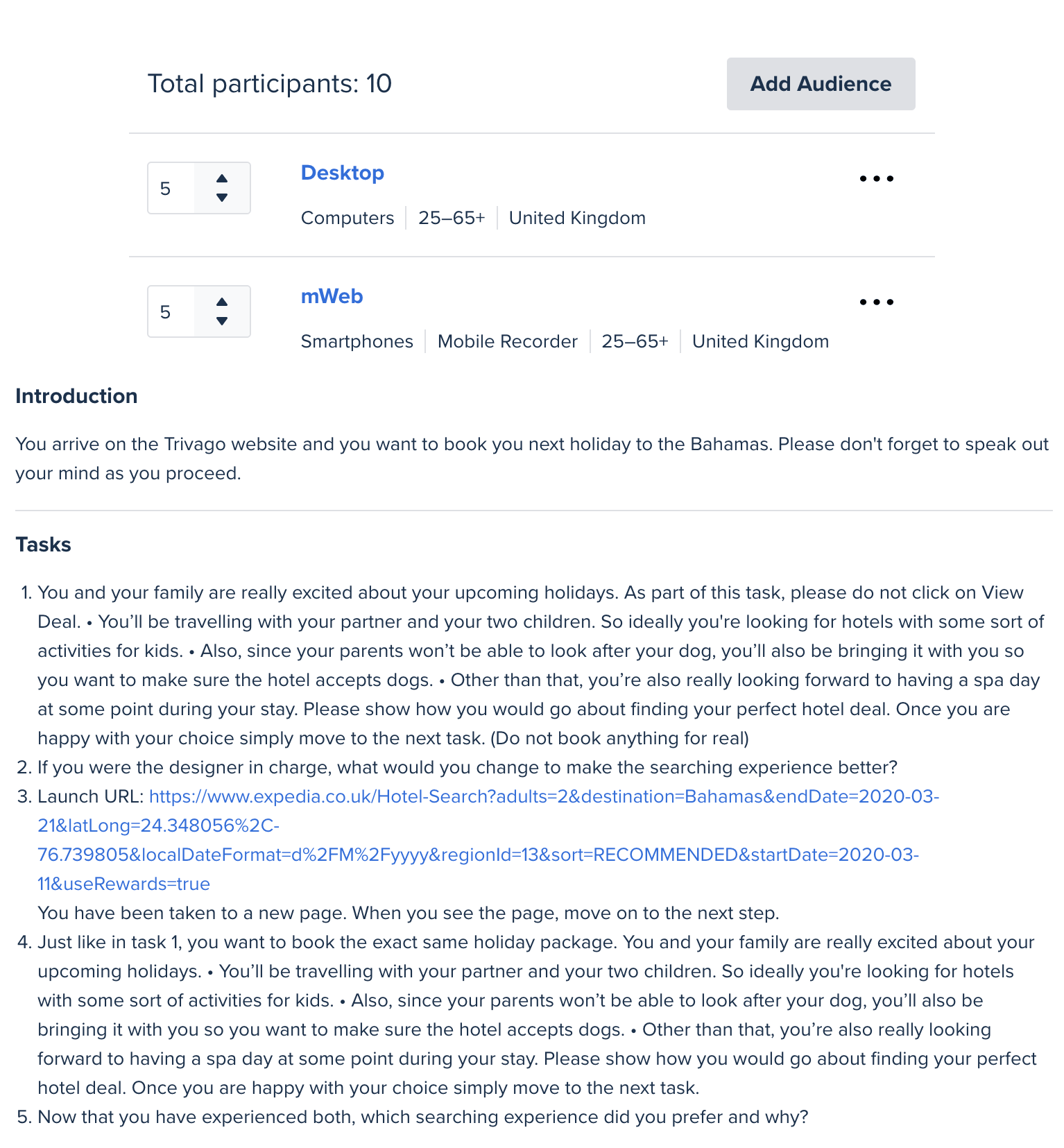
In order to better understand the mindset and behaviour of users performing a "Concept Search", a test plan has been built and launched on usertesting.com.
The audience consisted of 2 different sets of 10 users (5 on desktop and 5 on mobile) aged between 25-65+ and located in the UK.
The test plan invited them to complete a hotel search involving at least 3 filters available in "More filters" (Trivago) and then to complete the same take on another website with a different filter layout (Expedia). Then, participants were invited to decide which experience was their favourite and why.
In the task, the audience was asked to search for a:
Family-friendly hotel with activities for the children
Dogs friendly place
Spa amenity
On desktop, users would always miss the search bar at first and only notice it halfway through the filter scrolling when struggling to find some tags.
The problem is a lot of keywords would return no result when they could/should. A few examples are:
Dogs -> pets friendly
Children -> Kids activities
Pets -> Pet-friendly
Pain Point #1 - The Search Bar
Pain Point #2 - Static filters
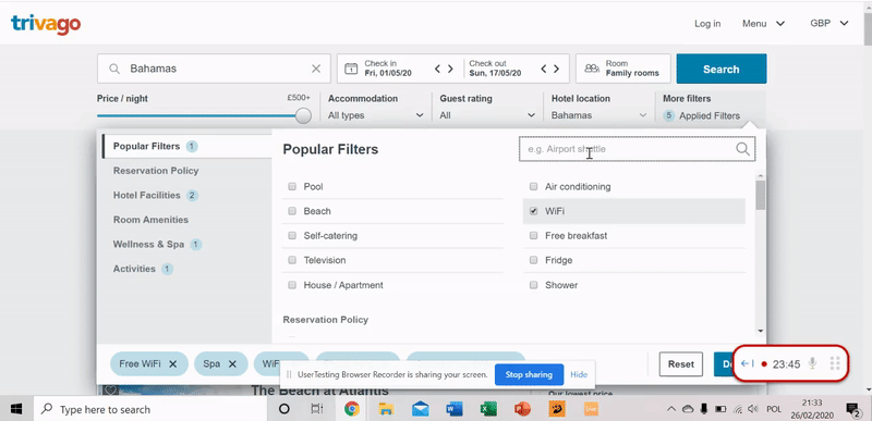
Right now users can apply a "boat rental" filter while looking for a hotel in the Himalaya or a "skiing" filter for a hotel in the Bahamas.
Obviously these 2 are edge cases but since there are a lot of filters available since they're not dynamic, they can become overwhelming for users.

Pain Point #3 - Lack of visual hierarchy
While desktop test results were pretty balanced with participants preferring one or the other website equally, out of the 10 users from the mWeb panel only, 8/10 preferred the filter browsing experience on the other website.
This could be explained by the fact that on Trivago, categories and their contained filters seem to have the same visual weight. It all blends together making it hard to navigate through.
That is especially true when the categories are collapsed: they feel like random filters.
Accessibility pain point #1 - VoiceOver
According to the World Health Organization, globally, at least 2.2 billion people have a vision impairment or blindness. Since Trivago has a worldwide audience, designing with accessibility in mind is an essential component of inclusive design.
When using VoiceOver in the "More Filters" tab, the help text within the search bar doesn't help much. The very problem is the long list of filters visually impaired users would have to tab through to complete a proper "Concept Search".
While this is a normal situation for listings in general, there are ways to improve the experience for better accessibility.
Pain Point #4 - Alphabetical sorting
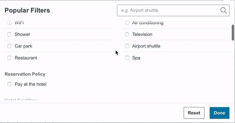
The filters are being displayed in alphabetical order instead of popularity and on desktop the sorting is applied row by row instead of column by column which would feel more natural.
On top of that the spacing between columns being very big, it creates more travel for the eyes during scanning.

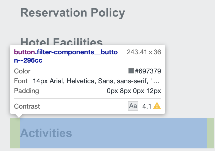
Accessibility pain point #2 - Colour contrasts
While inspecting the elements of the "More Filters" tab, it appears that the colour contrast used for the "Category" section is a little bit on the lower side meaning that people with colour blindness may struggle reading the text correctly.
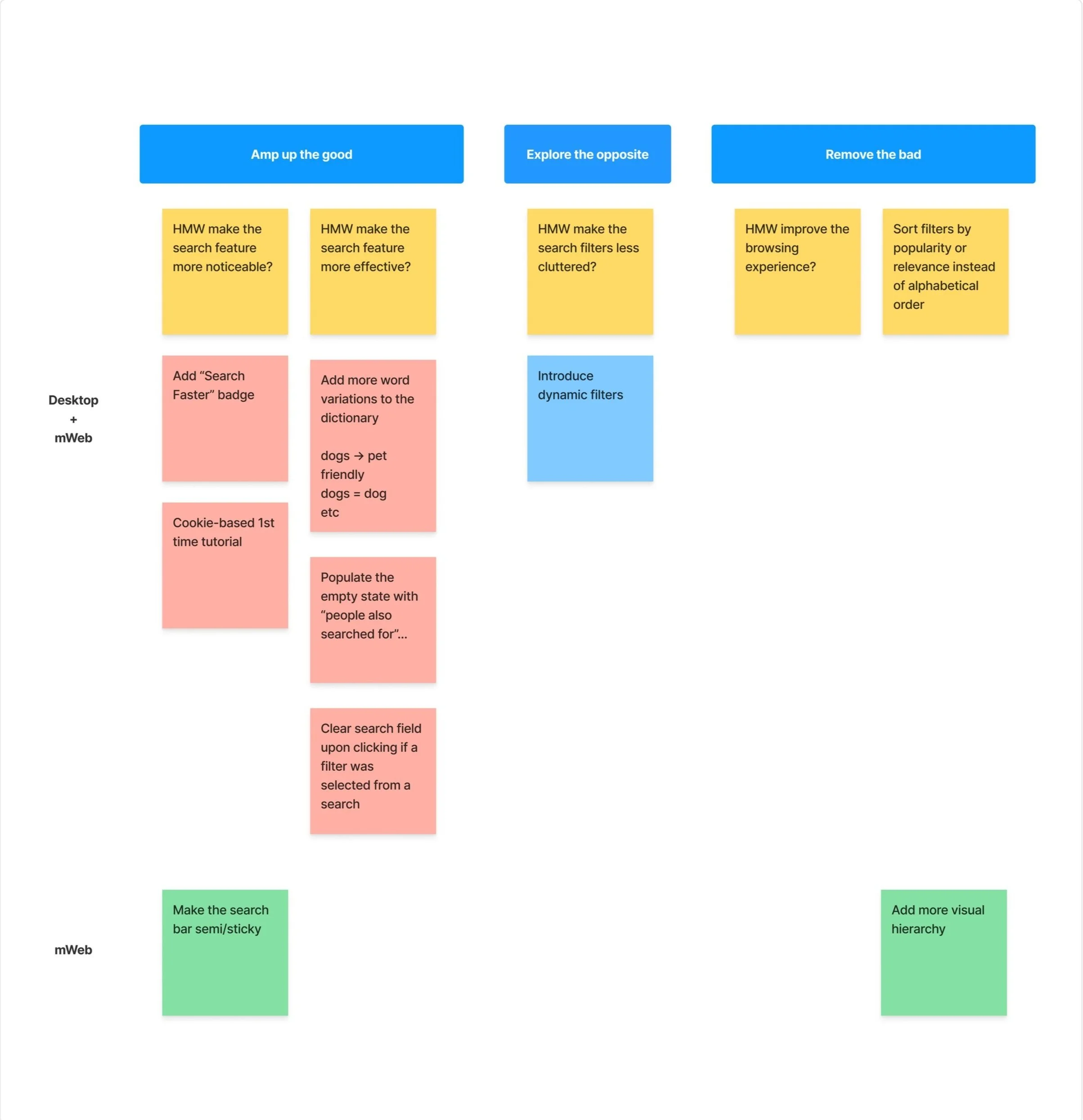
Generating the "How might we" questions
This step helps prepare the ideation coming in the "Develop" phase. Ideally, it would be run in a workshop format with key stakeholders of the project in order to brainstorm on set ideas, design vision, and hypotheses.
It is common practice to build HMW questions around different goals.
Amp up the good: HMW make the search feature more noticeable?
Amp up the good: HMW make the search feature more effective?
Explore the opposite: HMW make the search filters less cluttered?
Remove the bad: HMW improve the filter browsing experience?
Scope, considerations, and card sorting the HMWs
As part of the ideation phase, it is important to evaluate the ideas that came out of the workshop or in this scenario the solo workshop.
Since the usability testing revealed no particular preference when it comes to having the filters expanded as a lateral bar or stored within "More filters", this element will be kept unaltered.
Here are a few considerations in order to establish the scope of the action plan:
Focus on evolution not revolution
The live experience is already the product of extensive research and testing and is already very good. While I don't know all the rationales behind the choices made, I can appreciate their solid foundations. Therefore I will focus on optimising the experience rather than trying to change what already works.
Match the current design language in place
The proposed changelog has to fit seemingly within Trivago's brand guide. I will be inspecting elements of the website to establish a quick style guide.
Starting off with assumptions not proven statements
At this point in the process, the areas of optimisation that will be explored are not THE answer but rather a set of educated assumptions based on my experience and feedback collected during usability testing. The UX process is an iterative process and testing and validation of the assumptions are part of the final step of the process: the delivery.
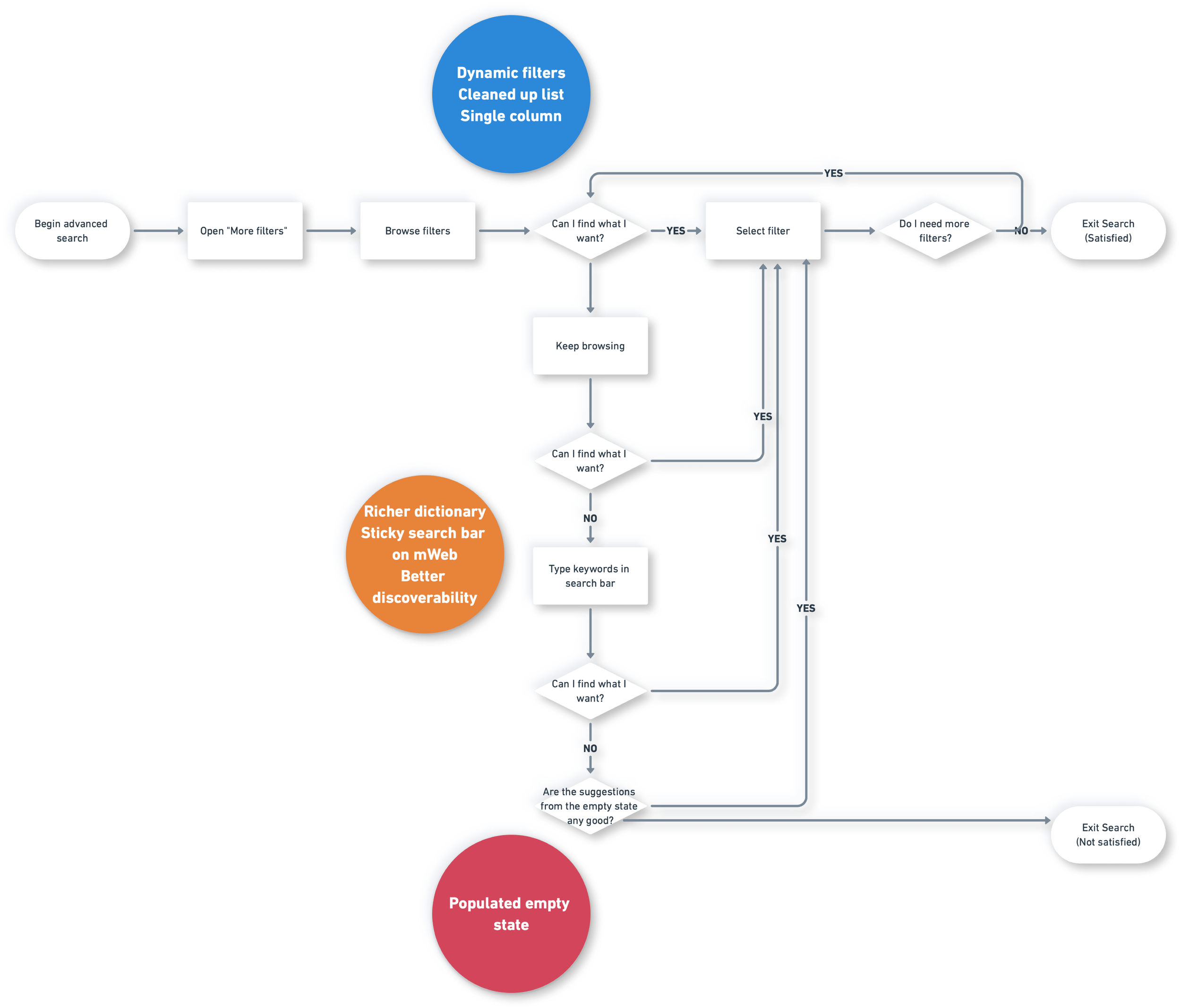
Now before prioritizing the actions, it is important to map out the user flow for a "Concept Search".
Concept Search user flow and actionable UX improvements
The usability testing has revealed that users tend to start off by browsing the filters which is the least cognitively strainful behaviour to adopt since making a choice based on a suggested list is easier than coming up with searchable keywords.
Only when that fails or proves to not be very effective do users use the search bar as a fallback option. However due to its limited dictionary and word combinations, the empty state for "no results" often shows up.
On the above flow, the main UX tweaks are shown next to the portion of the flow directly impacted.
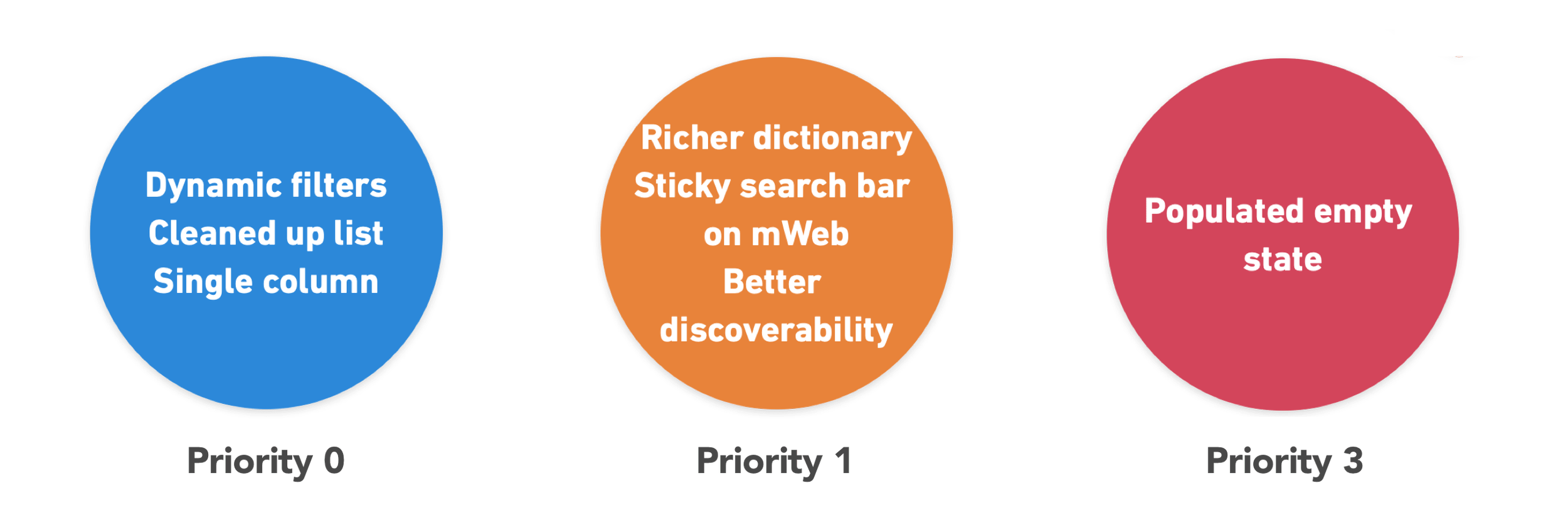
By following the logic of this flow a natural priority list can be derived:
Adding technicity and feasibility to the UX priority list
Now that we established the UX priority list of improvements, it is important to consult with developers in terms of feasibility and implementation time. This is useful to identify "quick wins" that would yield top priority when it comes to being developed.
Dynamic filters
When a user enters a holiday destination, in the backend all the filters not available in the search results for that destination are being hidden from the "More filters" list or alternatively, only the filters available are displayed, depending on which option triggers less load on the servers. This would clean up a little the filter list by removing any unnecessary and inapplicable filter.
In the long term, with the power of machine learning, filters can be sorted within each category based on popularity/relevance depending on the destination picked, the time of the year and the type of room booked.
The single-column layout for "Concept Search"
The single-column vs multi-column layout is an old debate. However numerous studies have shown that even though the form factor of the multi-column layout means it takes less screen estate overall, the single-column layout outperforms it.
According to a study by the CLX Institute, the single-column list was faster to browse.
Survey participants navigated the linear, single-column list (n = 356) an average of 15.4 seconds faster than the multi-column one (n = 346). This was significantly faster at a 95% confidence level.
Moreover, in the scenario of Trivago, it also enables to uncover all hotel visuals making the search even more appealing.
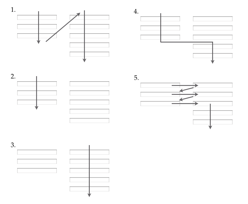
The multi-column layout, by essence, offers too many browsing options often resulting in missed information. This was outlined in the usability testing whereby users would hover the desired filter without noticing.
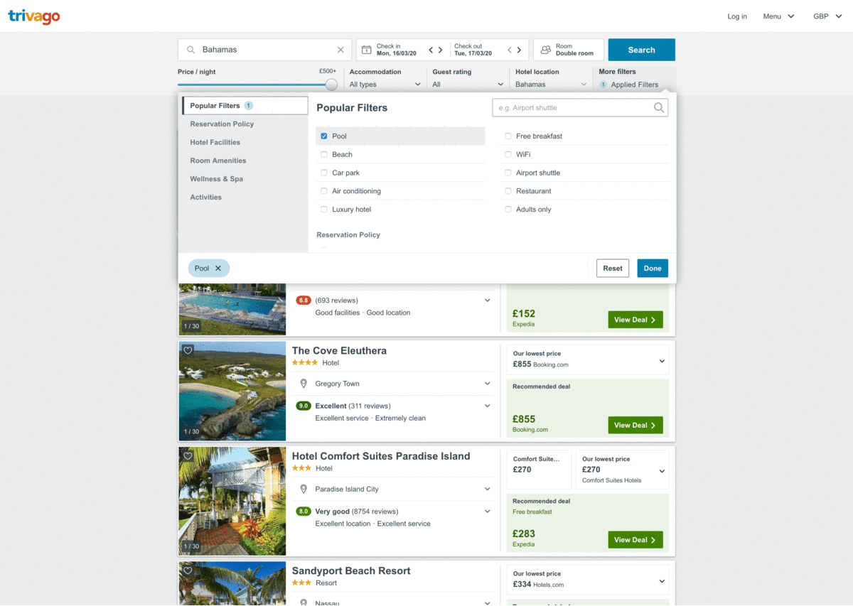
The below before (left) after (right) picture offers a visual comparison of the proposed change.
On both screens, the users can see at a glance the exact same amount of labels but the new navigation is overall easier and more effective. The search bar at the top is now more isolated making it stand out more.
In terms of accessibility, the colour contrast issue has also been fixed and in terms of screen reader voiceover, the user can immediately use the search function before tabbing through all filters.
In the current live version, the screen reader goes through the categories, then the selected category, then the search bar, then the filters. With the proposed optimised version, the information architecture has been fixed with accessibility in mind.
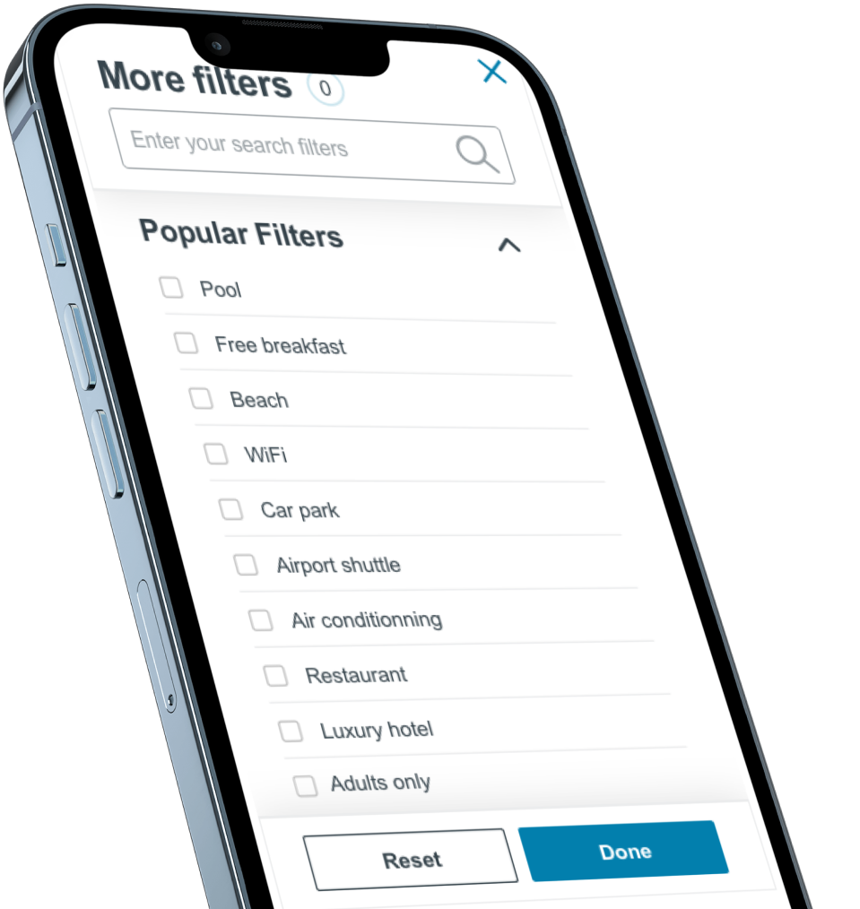
mWeb optimisation
After applying a series of optimisations on desktop, it is time to align everything with the mobile web version.
The real problem with the mWeb filters overlay is that there is no visual hierarchy at all. Font sizes are the same, and it's easy to get lost in that list.
The first step of the optimisation introduced different weights for the elements as well as a sticky search bar and the option to close the overlay at any point.
Checkboxes have been moved to the left to offer a visual accordion effect with indents on all subcategory labels. This left positioning also adds a consistent feel with the desktop version.
Last, the CTAs have been adjusted to still have the same visual weight while fitting the grid better.
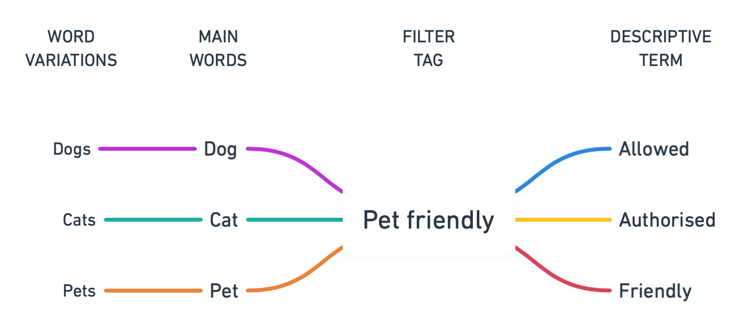
Richer dictionary of search terms
As mentioned before, the current search fre-fill doesn't cater for word variations like plural/singular forms or synonym descriptive terms. Therefore, a user could be typing "dog", "pets" and never get the "pet-friendly" filter.
Since the dictionary is localised, it means expanding it in every language available on Trivago, but this is a worthwhile investment to drastically improve the effectiveness of the search bar.
One of the ways to expand the dictionary is to start by analysing the most recurrent failed searches.
Populated empty state
The final optimisation on the list is to populate the view with "Suggested filters" when no search result can be found. This way the user never gets to a dead-end.
Next steps
The delivery phase consists of a set of prototyping, testing, iterating steps until user validation comes. The next step here is naturally to build and test the prototypes to validate the assumptions formed.
After that, the results are presented to the stakeholders for signoff before proceeding with developer handoff.