

In October 2022, Vitality, a global health insurance company based in the UK, approached us with a desire to consolidate their existing app ecosystem, attract a new user segment, increase daily usage of said platform and ideally, to design an experience that has the potential for global disruption. The stakeholder was keen on seeing a creative proposal that pushed the limits on what existing health insurance apps offer today.
Tasked with an ambitious brief and what felt like a substantial amount of creative freedom, I planned my design process before diving in.
Design Process
Research
Prepare Stakeholder interview questions
Create an interactive experience map with stakeholders
Create a business model canvas
Affinity map stakeholder interview notes
Pull out insights from stakeholder interview notes
Conduct competitive research
Decide on high-level research goals and prepare a discussion guide
Create screener survey questions
Craft an online survey
Craft user interview questions
Conduct user interviews (Aiming for 50-100)
Affinity map insights
Create personas
Define a problem statement and hypothesis
Create user flows
Design
Accessibility Considerations
Low-fidelity wireframing
Usability testing
High-fidelity wireframing
Additional testing
Prototyping
Create a client presentation
Pitch
Retro
About the Client
Vitality Health is a United Kingdom-based company specializing in private medical insurance sold to the UK market.
The company is a subsidiary of Discovery Limited and alongside VitalityLife and Vitality Corporate Services it forms Discovery Limited's UK insurance offering.
As of 2018, the company had approximately 1 million customers in the UK, split across corporate, personal and SME plans.
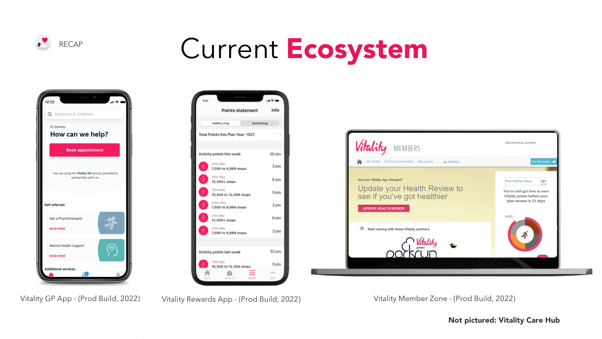
Current Landscape
At present, Vitality has a quite simple Vitality GP app. On average, they have over 12,000 consultations a month booked into the digital Vitality GP service.
There are several pain points with the service, but those most relevant from direct user feedback are:
Difficult to navigate user experience, often many clicks to get to the right place
Not sure the app is helpful for anything past booking/scheduling
They would like to have a one-stop shop for everything rather than multiple interfaces (currently there’s Vitality MemberZone, CareHub and App all with different functionality)
Challenge
I was tasked with re-imagining what digital health insurance looks like.
“What would a low-cost app-first digital health insurance/or subscription health technology solution look and feel like?”
For example, imagine if instead of Netflix, we had Healthflix? In one app, for a low monthly subscription cost, users could have:
Access and booking to virtual GP appointments
Access and booking to virtual Mental Health appointments
Access and booking to virtual Physiotherapy appointments
Nearest Urgent Care Centre, nearest pharmacy, nearest sexual health clinic- and much more!
Target Audience
Those who have purchased health insurance or been offered health insurance as part of their company benefits
Those who have an income to afford health insurance but are not willing to pay out of pocket for the current options in market would also be interesting
Students looking for a low cost health and care solution (local and oversees) are an interesting demographic too.


What does success look like?
A new prototype for a new health technology product that could disrupt the current UK landscape and market.. and possibly go global too!
And then, what else should this app include?
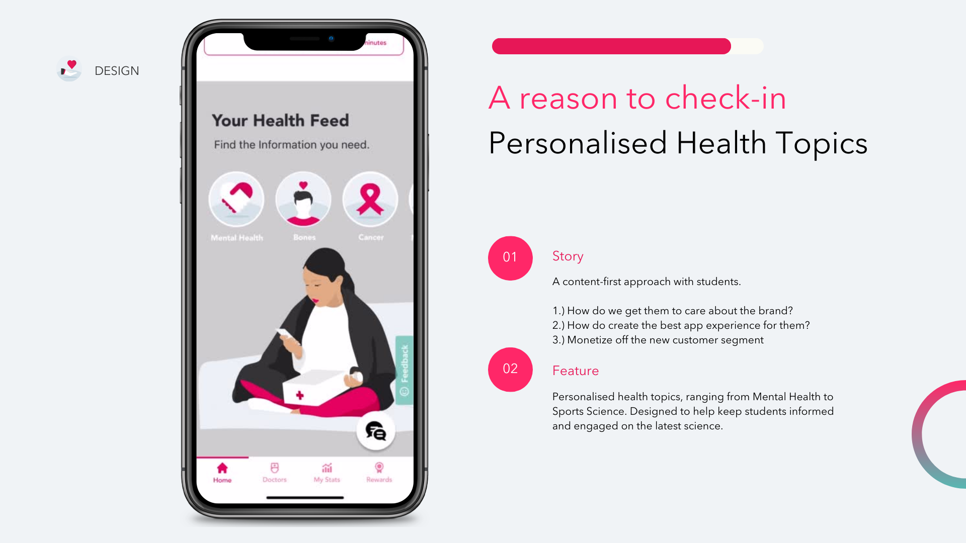
Personalised health content, your own health tracking dashboard for physical and mental health, connected health metrics from your wearables, when to go for a cancer check up or any other check up e.g. annual health screen.

Here’s a sneak peak of the design work
The “Before” - 4 different digital touchpoints.
The “After” - 1 streamlined, multi-functional app.
Lo-fi & hi-fi wireframes, mock-ups and prototypes can be found at the bottom of the case-study.

Step 1: Interviewing the Stakeholders
Some of the questions that were asked included:
💭 What features in the app are non-negotiable?
💭 Could you break down the main reasons for customer call-ins?
💭 Is there anything specific you want us to look into regarding the competitive landscape?
💭 Is there anything you like about your competitors’ mobile applications?
The structure of the session was the following:
1.) Ice Breaker 🧊
2.) Q&A about Company, Product, Users and Marketing
3.) Experience Map (Timeboxed to 30 minutes)
4.) Request for Additional Documents
The first step was to plan out the stakeholder session agenda. The stakeholders in attendance would be the Deputy Chief Medical Officer, Head of Primary Care Partnerships and Services, and the Associate Medical Director.
The session was a blend of Q&A and a collaborative Experience Map, that would allow me to better understand how the insurance process works, and what parts the stakeholders really wanted help with.
The meeting was a great opportunity to engage the stakeholders in an Experience map workshop, and it also enabled me to request additional documents that were pertinent to my design process.
Additional resource requests:
Viewing a demo of the apps in the Vitality Health ecosystem (a Vitality insurance membership ID was required to login, so I wasn’t able to go through the apps myself until later)
Viewing a sitemap document of the current apps (This would help me understand the existing, complex information architecture of the ecosystem)
Style & brand guidelines and any design system they have in place
Access to analytics or research reports (as deemed relevant)

Step 2: Creating an interactive experience map with stakeholders
The purpose of the experience map exercise was to find out what the customer is experiencing, thinking, feeling and doing at different stages of interacting with Vitality’s service.
This can help to get a sense areas which are doing well, frustrations and areas for opportunity.
Doing it collaboratively with the stakeholders can help get them involved and excited, ensure that the proper information is conveyed and can spark closeness that will help initiate a good relationship between stakeholders and designer.
The following instructions were given:
Write down 1 insight per post-it
You can include multiple insights per category
5 minutes per row
No right or wrong answers!
If you get stuck we can help with examples

Step 3: Creating a business model canvas
I created a business model canvas to help me visualise all the building blocks of Vitality’s business, including customers, route to market, value proposition and finance.

Step 4: Affinity mapping stakeholder interview notes
So after the long session with the stakeholder was over. I looked at my meeting transcripts and affinity mapped the notes into the following sections:
Stakeholder Goals
Product Concerns
Feature Ideas
Brand & Visual Ideas
🎯 Stakeholder Goals are to:
To create one ecosystem
To offer location-based care
To improve health data visualization
To provide an empathetic experience
To speak the language of the audience
To offer in-app content that results in daily engagement
🙁 Stakeholder Product Concerns are:
To use simpler language
To have better navigation
To centralize all the key Vitality resources
To have better signposting
To introduce in-app feedback collection
To have clear user flows
💡 Stakeholder Feature ideas are:
Medallia System Integration
Geolocation of health services
A health dashboard
A section that shows digiphysical services
🪞 Stakeholder Brand and Visual ideas include:
Wanting to be perceived as “the good guys”
Having a calm and peaceful look and feel
Projecting an empathetic tone of voice

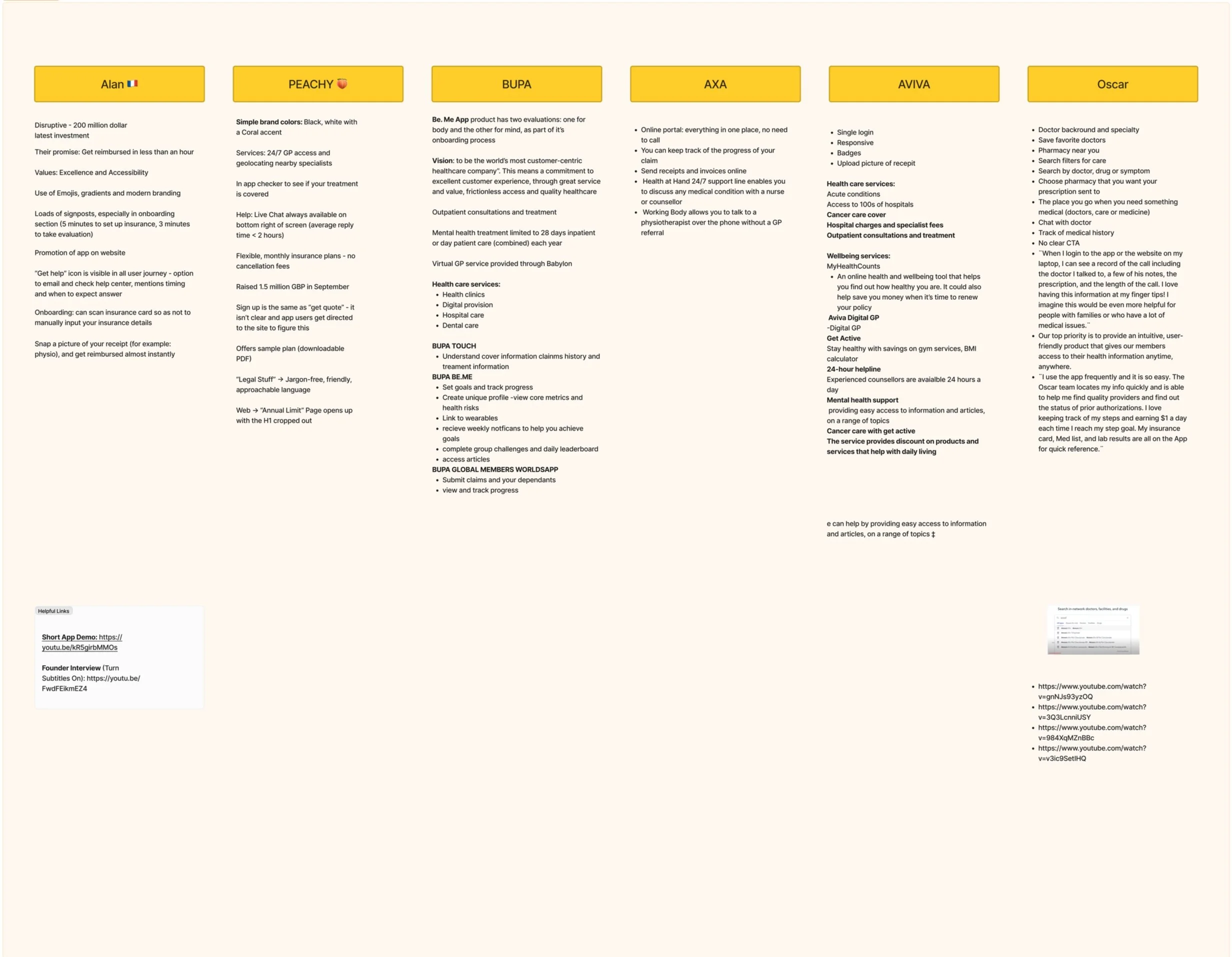
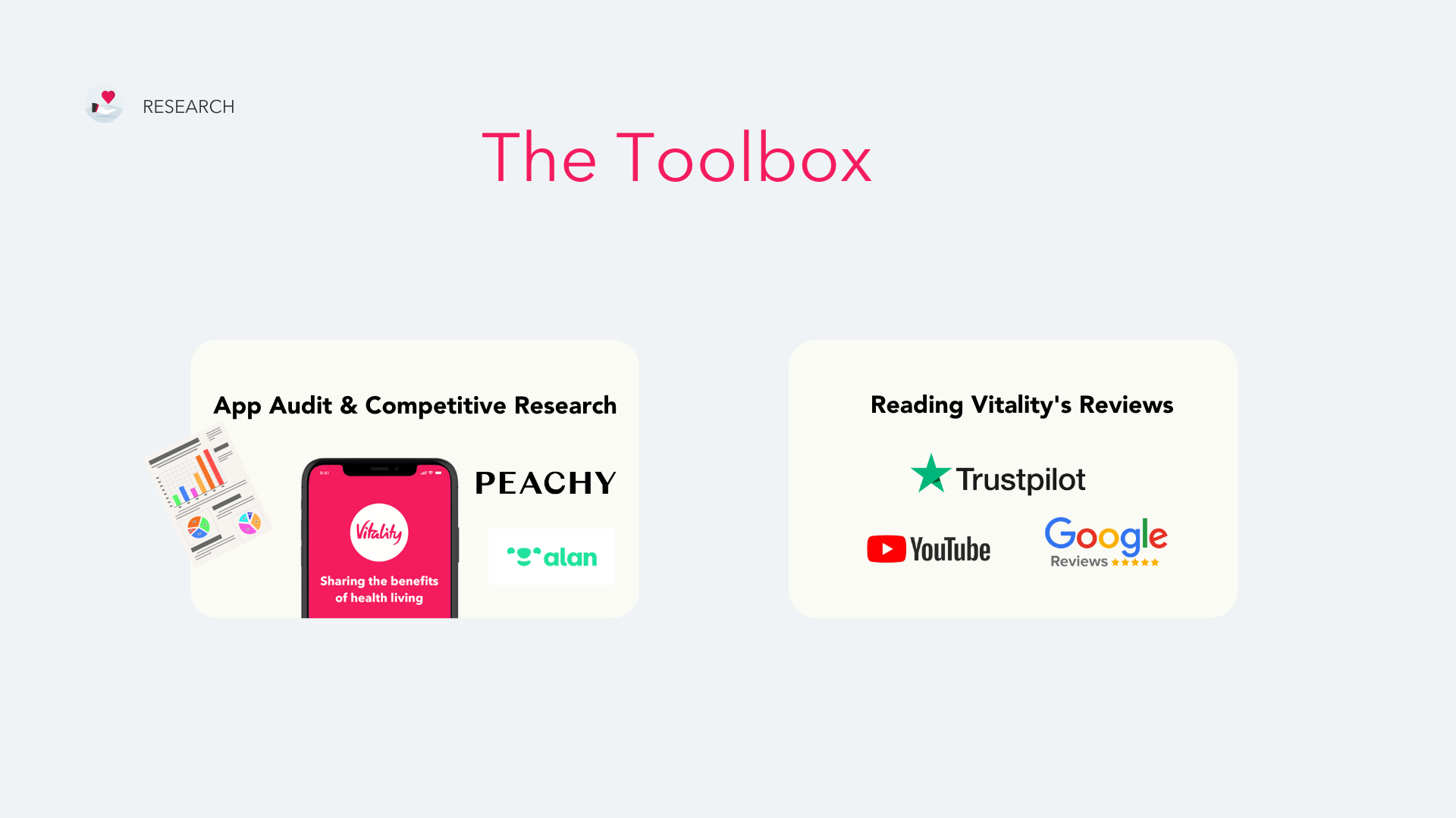
Step 5: Conducting competitive research
The main competitors that I identified were:
Alan
Peachy
BUPA
AXA
AVIVA
Oscar
Step 6: Deciding on high-level research goals and preparing a discussion guide
My high-level research goals were:
To identify any gaps or opportunities within the InsurTech industry in the UK
To uncover any segments that could bring additional company revenue
To uncover any “novelty” elements that could help the company lead the way in product innovation
In addition, my goals included:
To uncover any accessibility or inclusivity opportunities to improve the company’s UX standard
To find out how to make better use of the company’s content assets and marketing materials
To learn about individuals’ current experience using health insurance services
To learn about individuals’ pain points, frustrations, and uncover areas of usability improvement
To potentially learn how to incorporate new features to increase enjoyability - despite insurance being perceived as a “traditional and transactional” industry

Step 7: Crafting user interview questions
Questions were divided into the following categories:
General Health and Wellbeing
1.) What does health mean to you?
2.) What are your current health goals?
3.) Tell us about your experience tracking your health using an app or device?
4.) What would you want to know about your health that you don’t already track?
5.) Which sources do you currently get your medical information from? (Webmd, Tiktok, Reddit)
6.) Which health topics would you be interested in learning about? (News, breakthroughs, conversation starters)
Booking an appointment with a GP
7.) Can you walk us through the last time you booked a medical appointment with your GP?
8.) Have you ever had to make a claim? Tell us about that experience
Experiences with Health Insurance Providers
9.) How was your experience of choosing a private health insurance provider? How do you feel about it now?
10.) What do you expect from your insurance plan?
11.) What issues, if any, did you encounter after joining your insurance plan?
Reward Schemes
12.) Are you currently enrolled on any reward schemes ?
13.) What made you choose this one? How do you find it?

Step 8: Conducting User Interviews
The user interview process took around two weeks. It was divided into the following methods and target users:
Online, young professionals
In-person, young professionals
Online, students
In-person, students
Online, families
In-person, families
I aimed for 50 in-person user interviews with families and young professionals, 50 online user interviews with families and young professionals, and at least 20 in-person and online user interviews with university students.
Of which, 60% of the respondents were living in London. 40% of the students interviewed were international.

Step 9: Affinity Mapping Insights
I synthesized the user findings into the following insights and statements:
Users don’t want to wait
Users want tangible things
Users want to share their experiences
Students want to try before they buy
Users want continuity and choice
Users want to be included
Users want a brand that cares about them
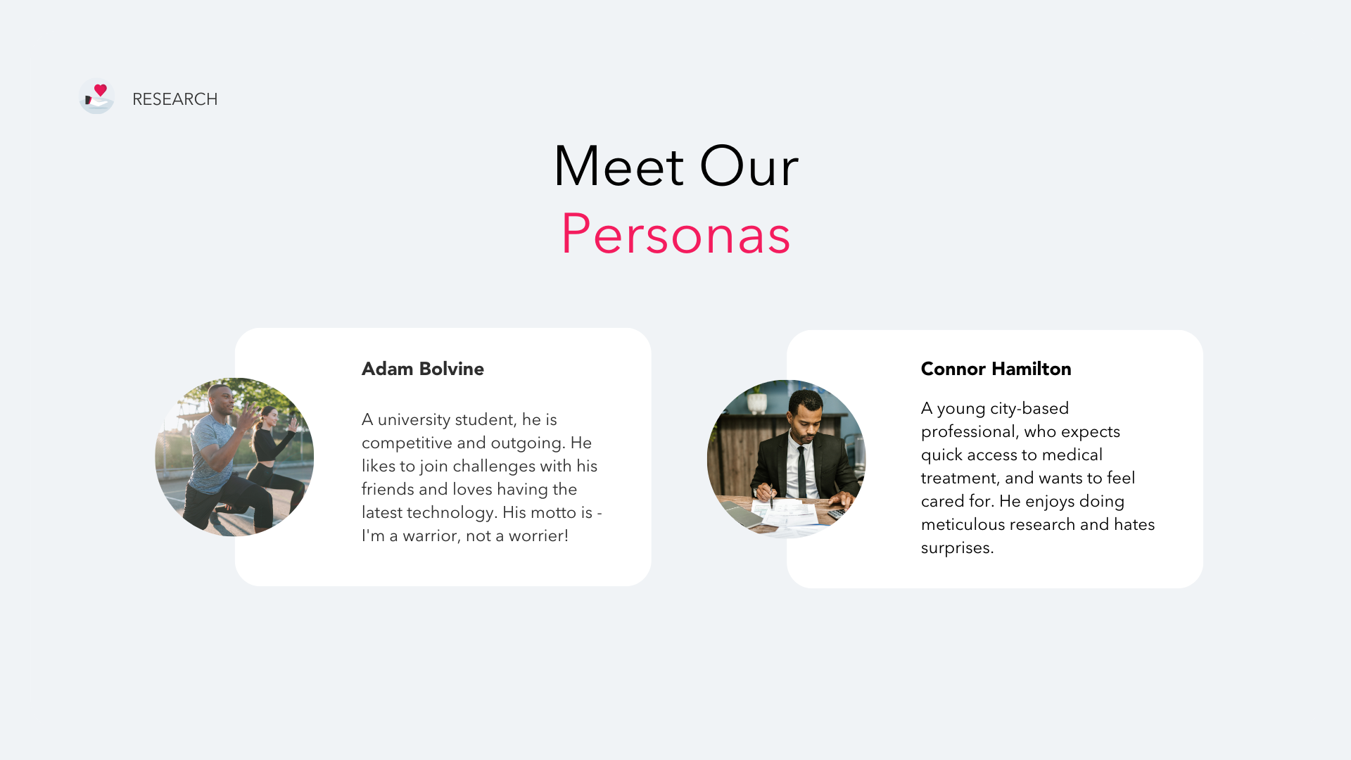
Step 10: Creating Personas
My first persona was Adam Bolvine.
A university student, he is competitive and outgoing. He likes to join challenges with his friends and loves having the latest technology. His motto is - “I'm a warrior, not a worrier!”
His user story is: Adam is a competitive university student who needs a challenging way to earn rewards because he loves the feeling of winning.
My second persona was Connor Hamilton.
A young, city-based professional, who expects quick access to medical treatment, and wants to feel cared for. He enjoys doing meticulous research and hates surprises.
His user story is: Connor is a young professional who needs quick medical access from a provider he can trust because he expects premium value for his money.
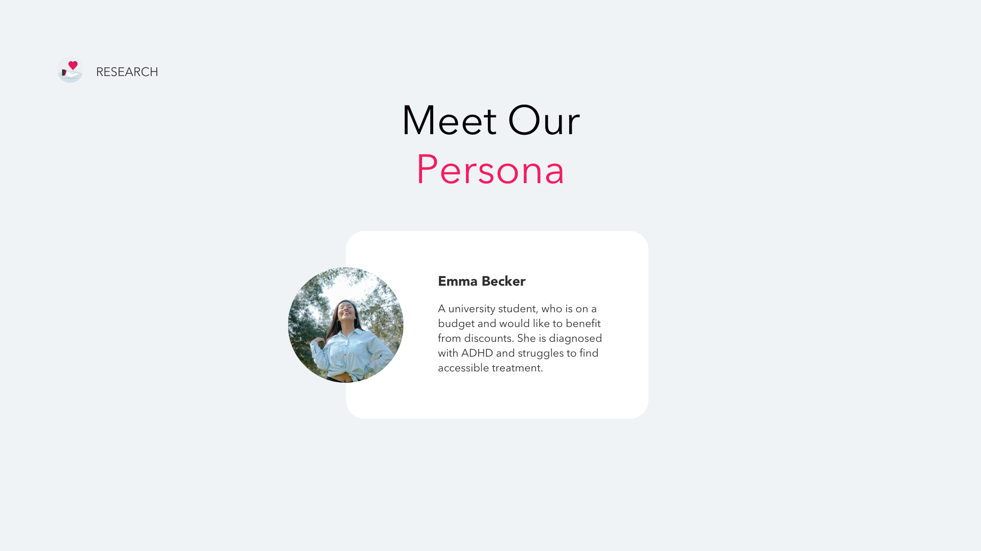
My third persona was Emma Becker.
A university student, who is on a budget and would like to benefit from discounts. She is diagnosed with ADHD and struggles to find accessible treatment.
Her user story is: Emma is a university student with ADHD who wants a reliable way to earn discounts on products and services because she is on a tight budget.
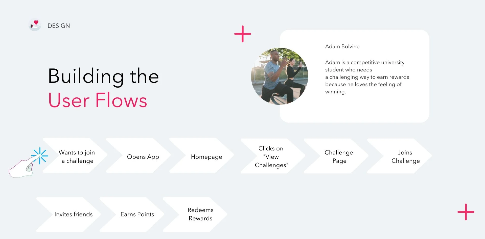
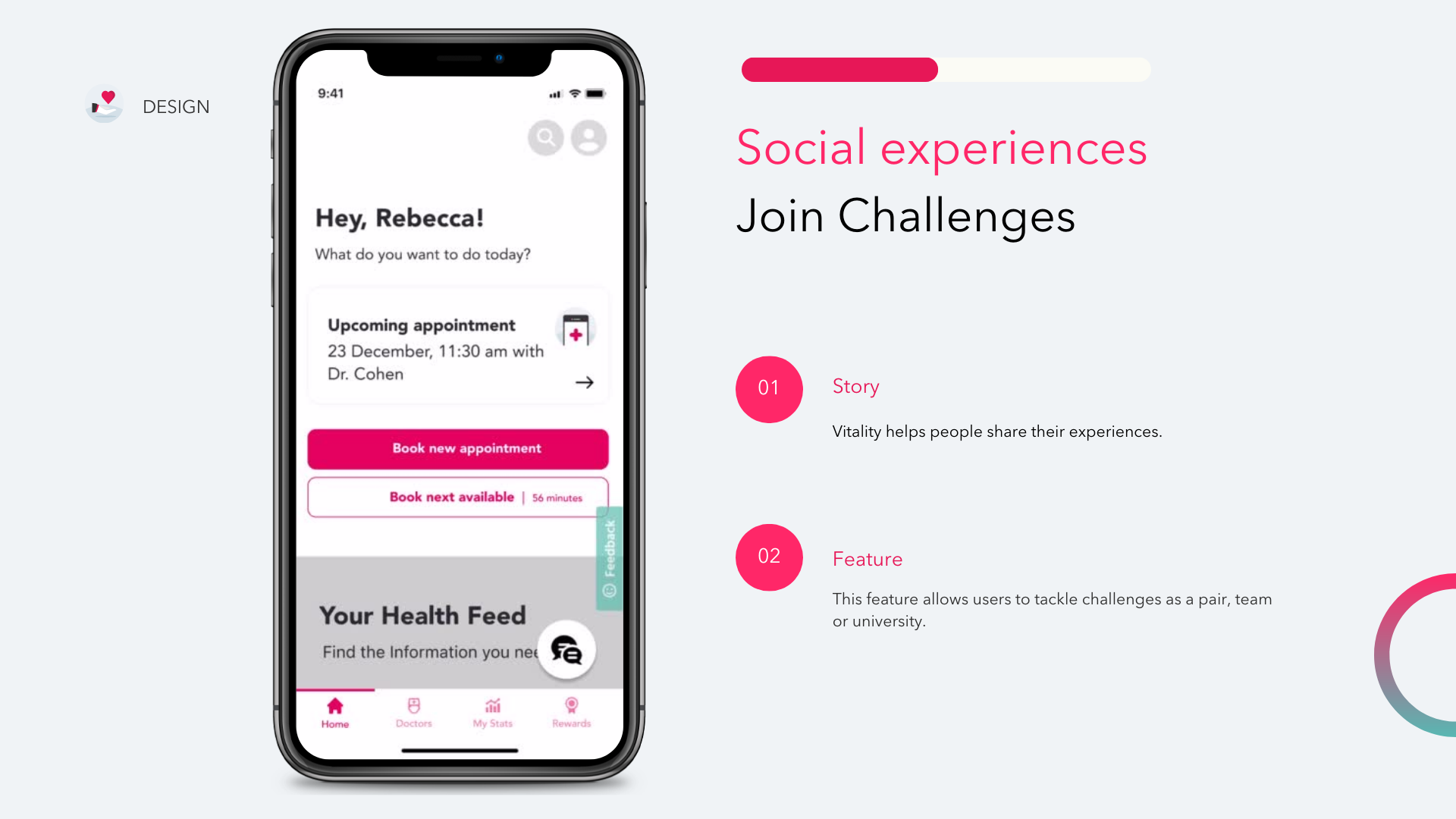
Step 11: User Flows
I built user flows for my three personas; Adam, Connor and Emma.
Adam’s user flow began with the desire to join a challenge, and ended with his redemption of a reward. This is an important part of Vitality’s offering, as they believe in encouraging customers to stay healthy and fit.
Connor’s user flow began with the need for a doctor and ended with adding his appointment to his ios calendar. His journey marks one that Vitality doesn’t currently offer, which is being able to quickly book an appointment with a GP you’ve already seen.
Emma’s user flow began with the desire for discounts and ends with a new subscription to the Vitality app. She represents a new flow that will allow Vitality to onboard new student customers. And because she has neurodivergent needs, this ties into new Accessibility guidelines that Vitality should follow.


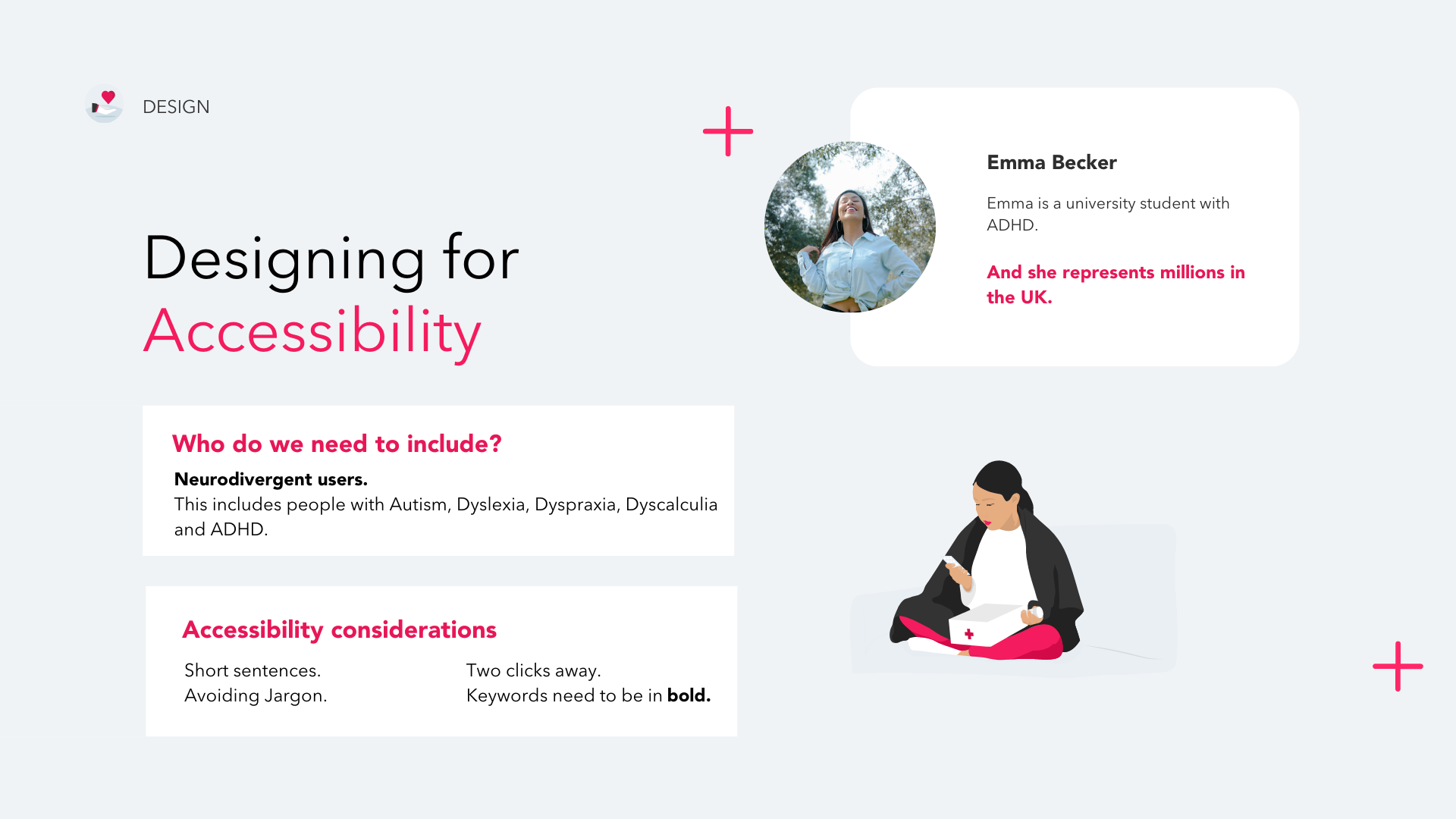
Step 12: Accessibility for Neurodivergent Users
Designing for Accessibility required the following considerations:
The use of short sentences
Avoiding jargon
Ensuring quick-paths that were two clicks
The highlighting of keywords
The Advonet Group, which provides independent advocacy, published the following resource on making information accessible for neurodivergent users. I followed these guidelines when designing.

The new Vitality Design System

Step 12: Low-Fidelity and High-Fidelity Wireframes
I sketched some low-fidelity wireframes, moved them to Figma and then went to high-fidelity after doing some usability testing on the overall flows and logic.
I then tested the high-fidelity prototype on a focus group of users and was able to integrate their feedback before the final pitch to the stakeholder.

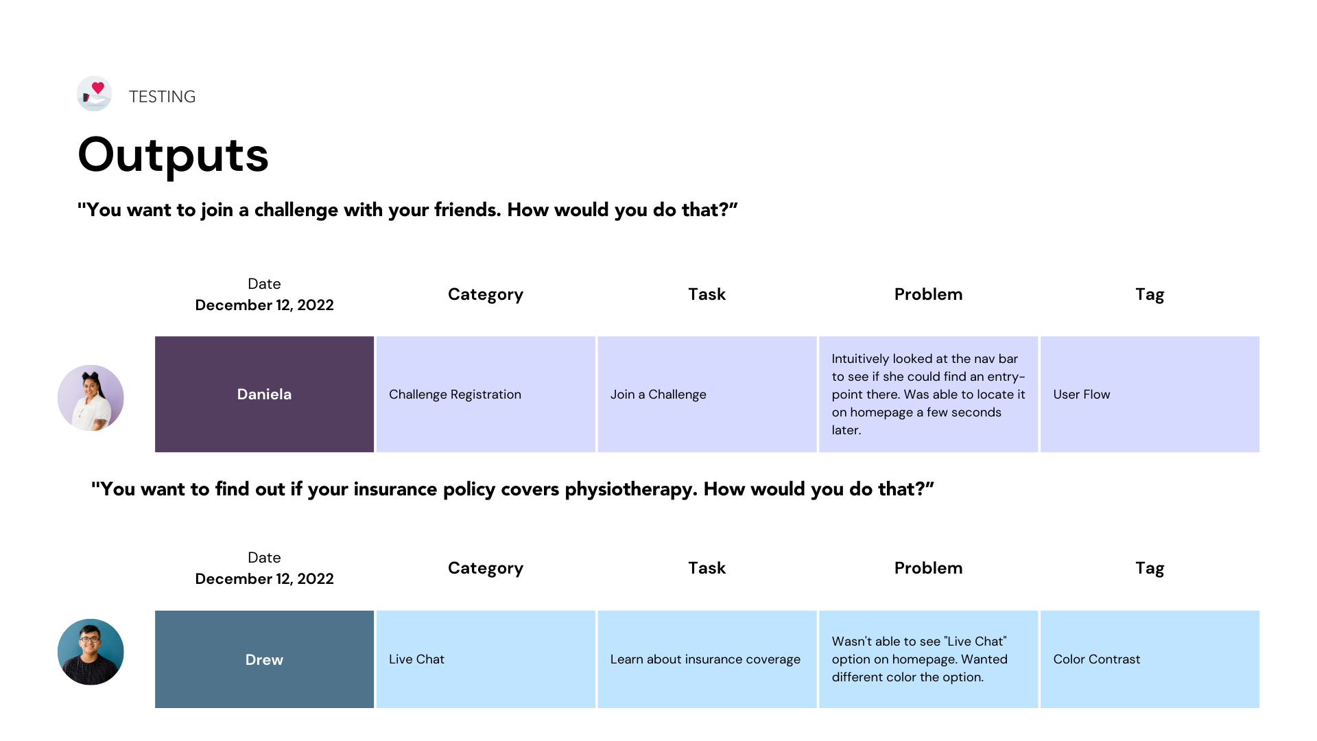
Step 13: Usability Testing
Throughout my usability testing sessions, I was able to get feedback on my app designs. Some positive aspects of the app were how easy it was to navigate the doctor’s booking flow and the social aspect of the experience.
Some recommendations included:
Wanting to know a clinic’s opening hours
Not necessarily needing information about a doctor’s education or qualifications
A different color for “Live Chat”

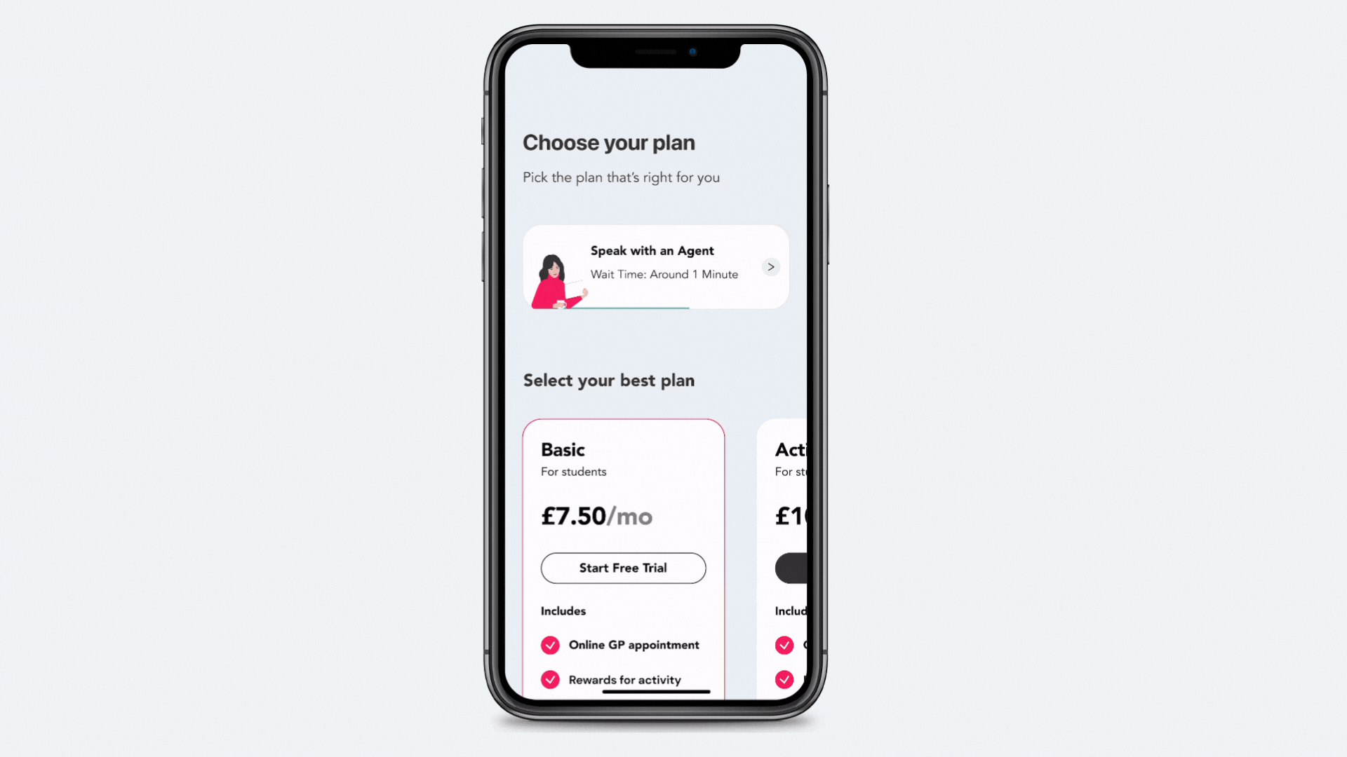
The New Vitality App Design
Here is a prototype of what the new app looks like.


Product Impact & KPIs
User engagement: Measuring number of app sessions, time spent in the app, and number of active users.
Chat response times: Measuring how quickly the live chat team is able to respond to customer inquiries can indicate the level of customer service provided
Doctor booking conversion rate: The percentage of users who start the doctor booking flow and successfully book an appointment can indicate the ease and effectiveness of the booking process.
Geolocation usage: Tracking how many users are utilizing the geolocation feature to find nearby services can indicate the usefulness of this feature.
Social challenge participation: Measuring how many users are participating in the social challenges that encourage healthy behavior can indicate the success of this feature in promoting healthy lifestyles.
Navigation and signposting: Measuring how many users are able to find the information they need quickly and easily through the app's navigation and signposting can indicate the effectiveness of the app's design.